By Nora Welch, Joining Vision and Action
With the recent passing of the torch between calendar years, chances are high that you’ve seen a few annual reports in your physical or electronic mailboxes. Chances are also good that you’ve had both positive and negative reactions to those.
While we could spend a whole other blog on the content components of a great annual report (I smell another blog coming your way soon), I’m going to focus our attention on the more visual side of things today.
From my albeit biased perspective as a graphic designer, a lot of times the look of your report is just as important as, if not more important than, the words. Who’s going to read something that’s visually off-putting?
No one. Ok, well some ones, because they’re invested no matter what. (Hi, partners or parents!) But you want to be pulling in any-and-every-one, right? (Hint: This includes potential donors.)
So, let’s make sure you are employing some graphic tactics to help elevate your report to “Wow!” and your organization to “We’ve got to support them now!”
Determine your theme.
Start with a general plan for the visual look of your publication. If you have a branding or identity guide—the official reference for how to use colors, fonts, tone, image style, etc. that represent your organization—use it. If you don’t, your annual report could be an opportunity to start building one.
Think about the “vibe” you want your annual report to have. Do you want it to be fun, bright, inspiring? Bold, serious or thought-provoking? These will all help inform the visual elements you choose later.
Think about other examples of reports you’ve seen and liked. While you might not be able to do exactly what they are doing (especially if you have vastly different content), it can still give you a spark of inspiration.
Bottom line, you want to have some idea of a direction about how you’re going to convey your information, what it will look like and what graphic tools you’ll use in the process.
Show VS tell.
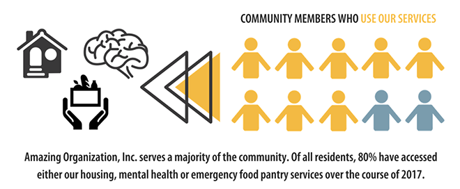
While narrative is definitely important in an annual report, use it to share what only language can. For all else, use pictures or other graphics to relay the story. For example, if your program serves eight out of 10 people in the community, use visuals to help share that statistic.

Show AND tell.
I know, I just spent the last paragraph sharing how it’s important to use graphics instead of words … and I meant it. I also want to point out that sometimes it’s helpful to have both the narrative and the visual. The two can work together to catch the eye, share the information and have it sink into the reader’s understanding.
Bam, not blur.
You want to make sure your visuals are crisp and really “pop” off the page. This is true on so many levels, but I specifically want to call your attention to photo or image quality.
Whether it’s your own logo, pictures of staff or even stock photos, make sure you have the appropriate resolution. While the answer to “what’s appropriate?” will depend on the size and distribution type of your publication, you can get a fairly good idea from either printing it out or zooming in on your computer. If the image is not sharp, i.e., it starts to get pixelated and/or you lose identification of what the object is, don’t use this picture. Find a better one or opt out.
Check for permission.
While we’re talking photos, be mindful of copyright and usage restrictions for outside sources. If you are using a free photo site like Unsplash or Pixabay or find an image through a Creative Commons search, you are *usually* safe to use the photo however you choose and without attribution. We, however, highly recommend double-checking rights for use and giving credit to photographers even if you don’t have to. It’s their craft, and it’s important to recognize and honor that.
For photos that may be coming from internal sources, specifically program participants or agency partners, make sure you have alerted them that their picture will be used. It would also be prudent to get a photo release signed.
Keep styling all or none.
If you’re going to use a certain styling component, make sure you do it everywhere. That means…
- If you’re using icons to accompany your list of services, make sure every service has a relatable icon.
- If you’re using a drop shadow effect on your photos, make sure it’s applied on all photos and at the same intensity.
If you can’t make it consistent, don’t use that styling component. To both the trained and untrained eye, it is visually jarring and confusing to be going along down one road and then hit a graphic pothole. You’ll leave most of your audience thinking, “What was that?”
Don’t force it.
If it’s not working, it’s probably for good reason. If you’re playing around with trying something this way and that way and back the other way, you’re likely on the wrong track. Follow the nudge. Do something different.
And, finally…
Follow Chanel.
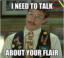
Photo from Office Space
Fashion icon Coco Chanel was said to have shared this bit of wisdom regarding accessories: “Before you leave the house, look in the mirror and take one thing off.”
While we’re not talking rings and necklaces, we are talking about colors, photo filters, borders and any sort of “flair.” Use them intentionally and sparingly. As much as we love Chotchkie’s from the movie classic “Office Space,” your annual report should not look the same as their servers’ vests.
Another Chanel principle to keep in mind: “Simplicity is the keynote of all true elegance.”
So remember … have a plan, use clear imagery to accompany your words, be consistent with styling throughout, and make sure that you’re not going overboard.
If you have any questions or would like to chat design, I’d love to hear from you! You can reach out directly by emailing me here. If you’re interested in working with our team on YOUR annual report, give us a call at (303) 477-4896.


Leave A Comment