
By Nora Welch, Senior Leadership Development Associate at Joining Vision and Action
Who knew I would be chatting design with my favorite hot-yoga teacher? But alas, there we were a few weeks ago. She was telling me that she had this awesome bumper sticker that she really wanted to put on her vehicle, but because of the typeface of the text she could not bear to affix it to her car. Sure enough, Comic Sans was the culprit.
Our conversation reminded me of the true power of design—both in positive and negative varieties.
More specifically, I realized how just one misstep with a core element can be the death of your design. So, I’m here to share with you today the value of making conscious choices about one of the basics: font.
Whether you call it “font” or “typeface,” choosing good visual representation of your text is essential. You might be surprised at the depth of information that can be shared for this (including what fonts are supported on various platforms), but that is another whole series. So we’ll keep our conversation focused and simple for the time being:
For most projects, I find that between two and three fonts usually get the job done:
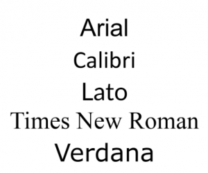 1) A base font.
This will be used for the majority of your text, specifically any longer passages and crucial information. The style for a base font should be a clear, easy-to-read variety.
Classic examples of this are Arial, Times New Roman, Tahoma and Verdana, with “newcomers” Calibri and Lato and many similar variants gaining. No, they’re not exciting. That’s the point. They’re meant to be readable. Exciting is reserved for …
2) A flair font (or two).
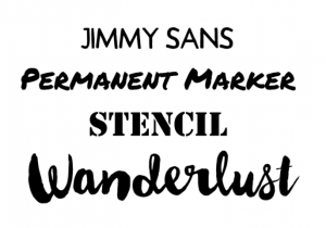 This is used for things like headlines, callout boxes and other “hey, look at me!” text. If you’re looking for an opportunity to use a super cool (and thus likely highly stylized) font, this is the type of stuff to use it on.
Examples are fonts like Jimmy Sans, Permanent Marker, Stencil and the ever-present and popular Wanderlust.
Yes, the ones I mentioned are less likely to be prepackaged in your computer’s standard fonts, so you’d need to find and license appropriately. However, even a basic copy of Microsoft Word will still have flair options.
A word to the wise about selecting a flair font: Try it out on ALL of the text you plan to use it on before making the final commitment. Sometimes a funny “q” or “z” can really throw off your look.
Also, for any font you’re considering using, check out the available weights (i.e. “bold” options) and other letter styles (i.e. italics). This may not be critical for your design, but especially for the base font, I really appreciate having the option.
Bottom line. Be careful and calculated about your font choices.
Don’t be an awesome bumper sticker that never gets stuck to a bumper.
Want to design some awesomeness together? We’re running a promotion on our annual reports. If you book between now and April 13, 2018, you receive 10% your total design project!

Have questions? Ready to get started? Email me here or give us a call.


Leave A Comment